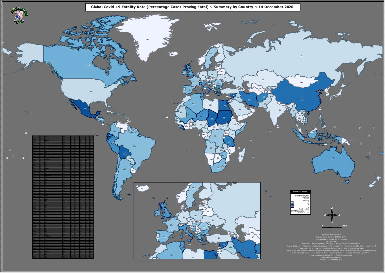
Update June 2021. The data underpinning our C-19 map series has been collated and made available free of charge by the European Union (references and URLs on the map – just click the main map thumbnail below), for which we and you have been very grateful. However the global scope of the data update was discontinued on 14 December 2020, hence this being the last of our global update maps. From 15 December 2020, the EU confined it’s daily C-19 updates to EU member countries only. For the curious, here is a screenshot of how the most recent data appears – we’ve added the date of the last update to the labels – we trust you can understand why we no longer considered it appropriate to create further daily global map updates.
This year 2020, it sometimes seems all we have been fed by politicians and the media are scary Covid-19 “case numbers” and frightening news “..another grim milestones as the USA recorded it’s 16 millionth case today” (re-broadcast on Channel 10 TV evening news 13 December 2020). You may have seen our daily updates of the raw case and death numbers, but here’s a map to put the actual severity of Covid-19 into an appropriate context – how lethal it is – you’d be forgiven for thinking it’s been as bad as HIV or Ebola virus! Click this screenshot to go to a full poster-size downloadable version.
The actual figures are simply not as bleak as we’re being told, most infected individuals make a full recovery, just as we do when we catch a seasonal cold or influenza, especially so in the developed world. In our home country of Australia for example today (14 December 2020) the fatality rate ((number of attributed fatalities / number of diagnosed cases)*100) is 3.2% (908 fatalities from 28,031 cases). However if we exclude the bungling state of Victoria’s third world approach to contagion management from the national tally (908 less 820 Victorian fatalities = 88) the fatality rate becomes 0.31%.
To put these figures into context, the most recent published figures for seasonal influenza in Australia are from 2017 and are summarised by the Australian Bureau of Statistics here – 1,255 fatalities from 251,142 diagnosed cases = 0.49%. Certainly, without Covid-19 specific social distancing, travel and related restrictions, the fatality rates would likely have been higher, but if you check the national statistics presented on the actual map (the link to the raw data is on the map, if you’re inclined to check!) you’ll discover the global average is 1.7% fatality rate with a median value of 1.65% (today 14 December 2020).
Just in case it isn’t clear enough from a casual inspection of the map, the USA’s response to Covid-19 is the polar opposite of what we’re led to believe by the media. Big populations always have big numbers. Every day of every recent year in the USA approximately 7,800 pass away from any number of causes. Covid-19 has been attributed as the cause for approximately 1,200 per day this calendar year, though we’ll never know how many of those died directly by Covid-19 infection and nothing else, as opposed to those dying from co-morbidities, but who also were designated Covid-19 positive. It seems in both cases, they have been tallied as Covid-19 victims and nothing else. Doing what we do, this strikes us as classic GIGO!
Yes, we all could have done without Wuhan’s New Year gift, but it could have been a lot worse and it’s certainly not as abysmal as the TV news would have us believe!


Give a round of applause in the comments to show your appreciation!