February 2023. Latest updates from June 2022 data release added to the end of this post!
Because of the impact of pandemic measures on the economy, we have posted the business counts for Lockdown Year 2021 separately.
The following maps show the mixed fortunes of the Greater Sydney region, on an annual basis since the current format business count figures were first collated for the four year period 2007-2010, published by the ABS 2011. The first map shows the actual average number of all operating businesses for each postcode for the initial four years – this is the 2011 base line from which subsequent departures will be calculated. Later maps and comments are added at the end of the post each year.

Base Business Count Numbers 2011 (ABS Avg 2007-2010)
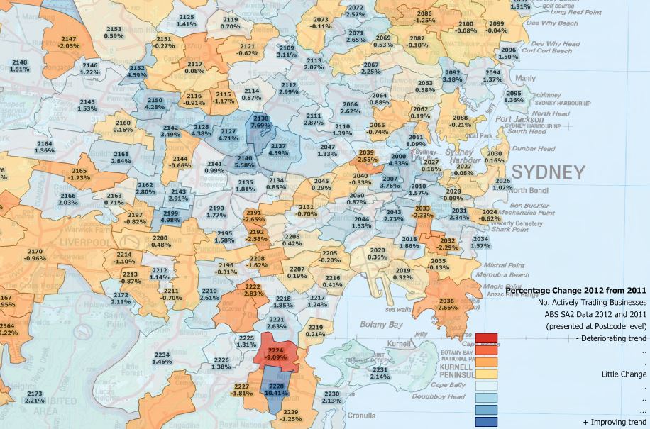
The following example demonstrates processed ABS business count data from 2011 and 2012 but analysed to postcode area level. The two sets of business counts are presented as percentage change from 2011 figures. The mean change for NSW plus the ACT over this period was +0.63%. Please note only random postcodes and values are shown in order to remove overlapping labels.
Note also the ABS data are four-year averages; for example data published for 2011 includes data for the years June 2007 to June 2010 inclusive.
Immediately below is the result of business activity data published 2014.
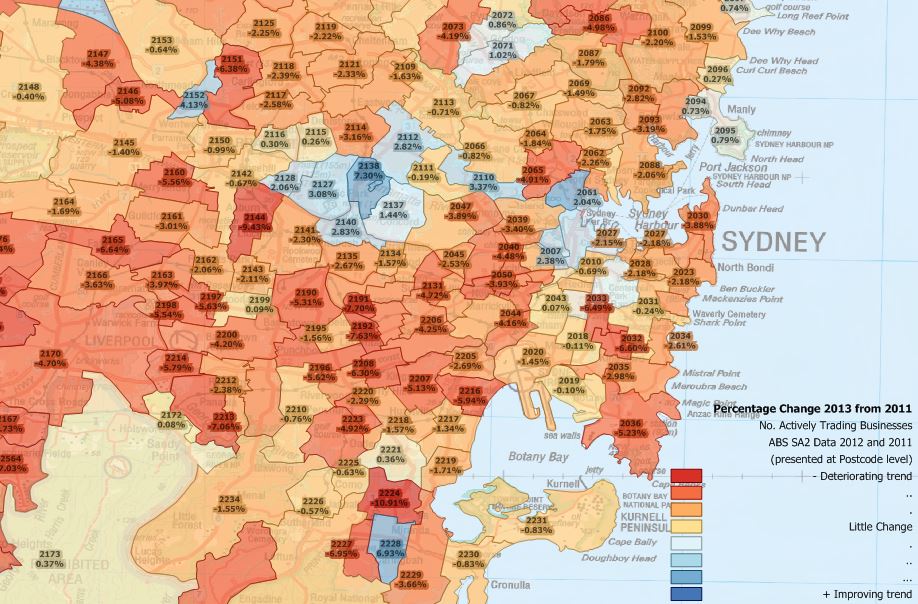
Using the same starting point as the example immediately above (i.e. aggregate total business activity for four years), this analysis quantifies the change up to 2013 in the same area.
While a few postcode areas have maintained a positive trend in business activity over the period, the 2013 data indicates a clear decline in overall business activity for the majority of postcode areas in the Greater Sydney region, with many previously growing postcodes slipping into decline (impacts from the GFC may be reflected in the data).
This is confirmed by the mean change in number of actively trading businesses over the whole of NSW plus the ACT – +0.63% growth in the previous period (above), but a negative -1.45% in this data.
Released in 2015 is the 2011-2014 business count data. Again we have analysed the numbers and transformed them to postcode level, where most of us can make sense of the patterns. The trend is slightly better than previously, especially for Sydney. The mean change in number of actively trading businesses over the whole of NSW plus the ACT -1.45% in the previous period (above), is a slightly less bad -0.91% in this data. For Sydney postcodes visible in the image the result is -0.23% compared to -0.91% last year.

Percent change in number of operating businesses 2011 to 2014
Released mid 2016 is the business count data for the reporting period ending 2015. Repeating our analysis of these SA2 records at our postcode area level, the overall change in number of trading business from the 2011 base level is now +0.16%, so back on track. However the country’s population has increased by about 14% over the same period, with much of the migrant and refugee intake choosing to settle in large cities including Sydney, so per capita business activity may be considered as still negative. For Sydney postcodes visible in the image the result is +2.46% compared to -0.91% last year.

Percent change in number of operating businesses 2011 to 2015
The situation is similar for the business counts for the four year period ending 2016, released by the ABS in early 2017.
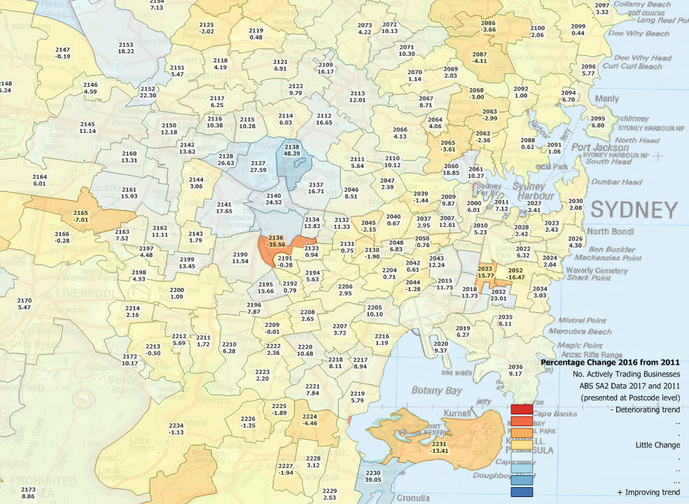
Percent change in number of operating businesses 2011 to 2016
This is now a five year span from the 2011 base line, so in a static / stable economy, the number of businesses should have increased in broad proportion to the cumulative sum of population change plus base line economic GDP change (5*(2 + 2.5)) = 22.5% anything less suggests some economic upheaval at the level the data are presented. Of course an existing business may expand and still only be counted as a single business. Others may contract, as demand for their services reduces, perhaps as the ethnicity of the postcode changes. If anyone has a better figure for Sydney’s population and GDP growth over this period, suggest it via a comment below and we’ll consider replacing our seat-of-the-pants formula. Here are those positive growth postcodes for the area shown, plenty of support jobs around the Concorde Repatriation Hospital it seems!

Postcodes with real growth in the number of operating businesses 2011 to 2016
And here is the percentage change in numbers of operating businesses 2011 to 2017 data released 2018.
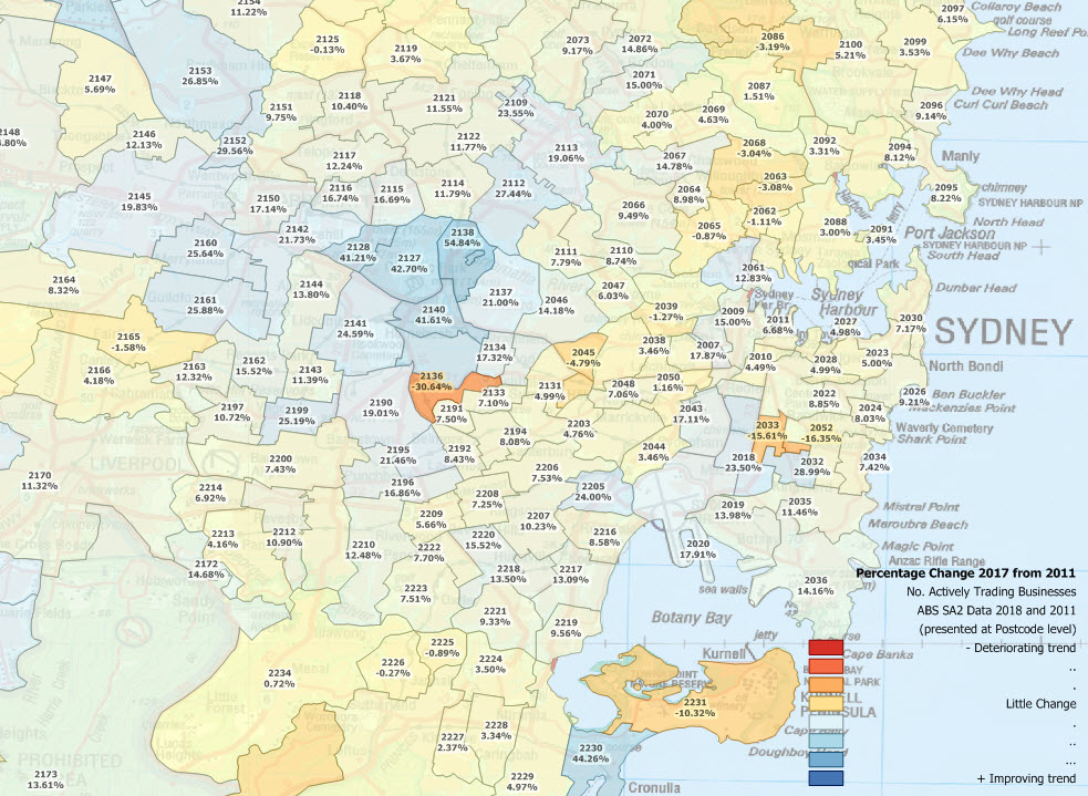
Percent change in number of operating businesses 2011 to 2017
Here’s an analysis of differences between the rate of population growth and the rate of private business change between the two censuses 2011 and 2016.

Differences between population and business growth rate percentages 2011 – 2016
Anything less than 27% isn’t cutting the mustard (same basis as previous calculation with the addition of another year). Here are those few postcodes which are cutting it.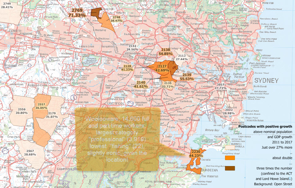
Percent change in number of operating businesses 2011 to 2017

Here’s how the release 2019 (four year average to 2018) data look.
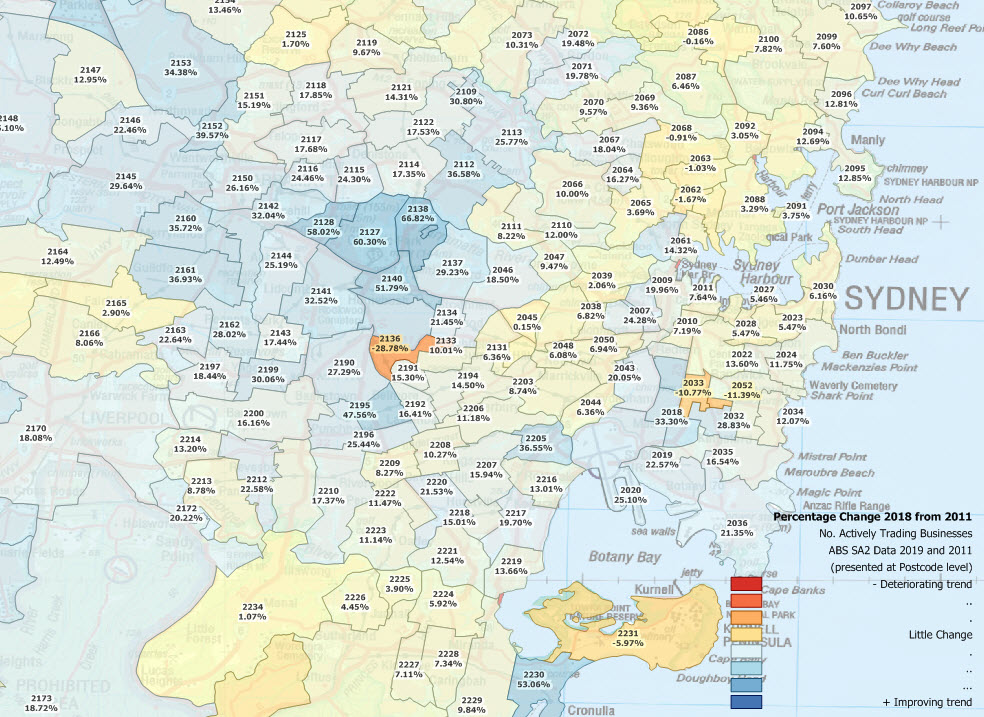
Percent change in number of operating businesses 2011 to 2018
Here are those updated 2019 figures published February 2020

Percent change in number of operating businesses 2011 to 2019
The average rate of change in numbers of businesses per postcode area for the area shown since the first data were published in 2011 is +18.92%. While this may sound impressive enough, if we look at the overall population growth for Greater Sydney since the 2011 Census ((3,900,000 – let’s round it up to 4,000,000) and the figure at the time of writing at australian-population,com – Sydney of 5,230,330, (screenshot taken 09 April 2020) that’s an eye-watering +30.75%!

Population of Greater Sydney June 2018
Is it any wonder there are growing calls for an enormous scale-back of the Nation’s immigration rate, given that businesses are the sole source of productivity in an economy and sole generators of taxation revenue – direct or indirect – for all levels of government? While there may be some variation if we compute revenue streams or confine ourselves to certain sizes of employer for example (yes we can do all of that, please get in touch for an obligation-free chat – we’d love to hear from you!), we wouldn’t expect a significant statistical departure from this overall discrepancy between immigration-fuelled population growth and the underlying productive sector of the economy which is expected to underwrite the costs.
Making the same comparison for one of the nation’s unemployment black spots, we include the same analyses for northern Tasmania here. These analyses have been repeated and updates posted here for data to 2020 published 2021.
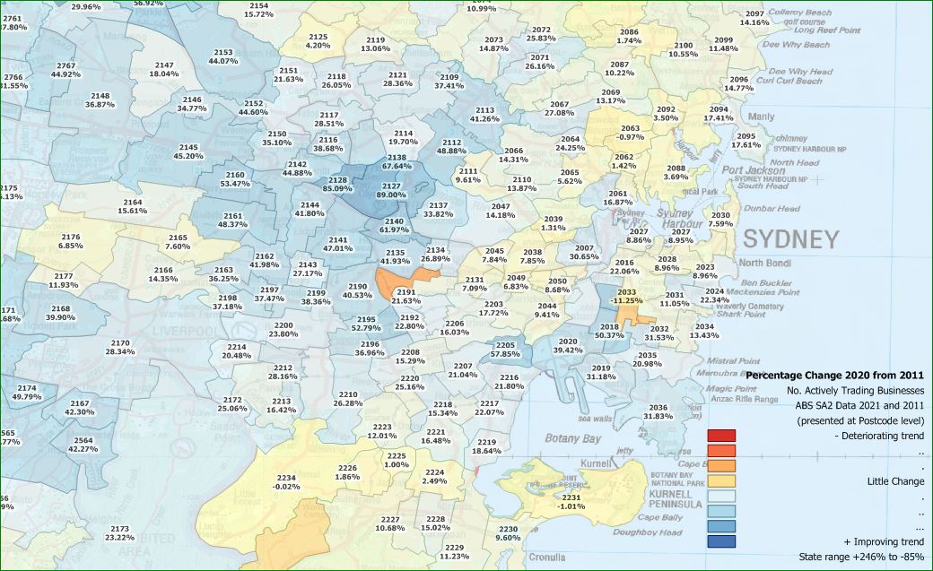
Percent change in number of operating businesses 2011 to 2020
The period covered includes only three months of the “emergency responses” – April through June 2020. The extent of government interference in the private sector economy had not yet become glaringly apparent, most expecting the restrictions imposed to be temporary. How wrong we were! The extent of the devastation to the real economy can be seen in the first update including a whole year of private sector business destruction in this additional post – and bear in mind the numbers are four year averages – so three “normal” years and only one “totalitarian” year – July 2020 to June 2021 (ABS data here).
Update September 2022. Owing to the Covid-19 measures imposed on the businesses of Australia, we are posting separately annual updates for the Lockdown years of 2020 and 2021.
Here is the result of processing the four year averages to June 2022.
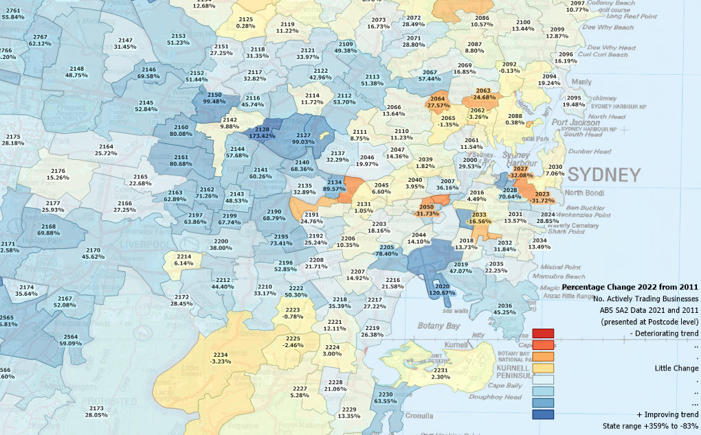
Percent change in number of operating businesses 2011 to 2022

Proportional change in business numbers to population 2011 – 2022
Only MapMakers’ data products allow this level of analysis and insight – even updated to reflect annual change in population in this example!

